Logo Design
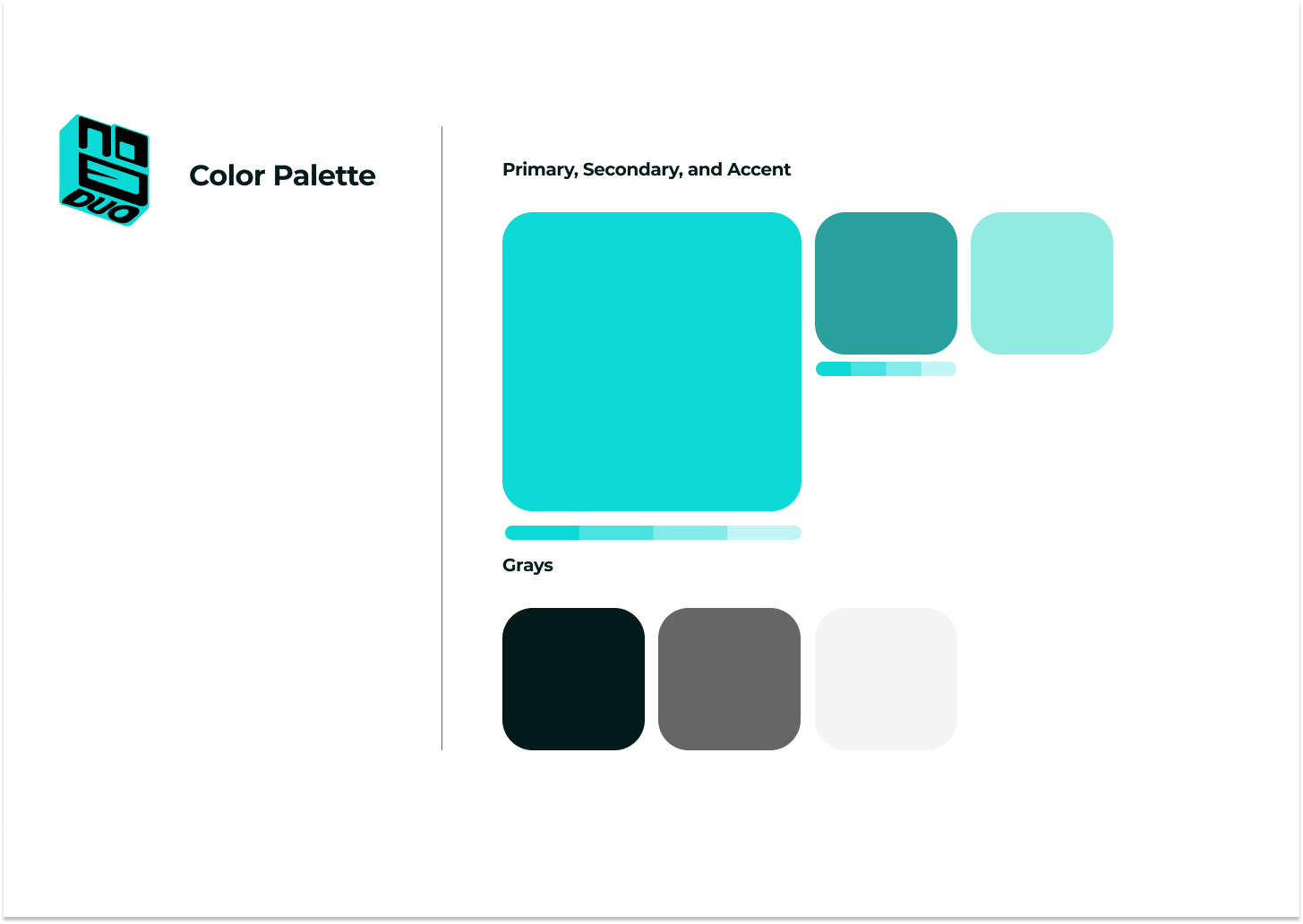
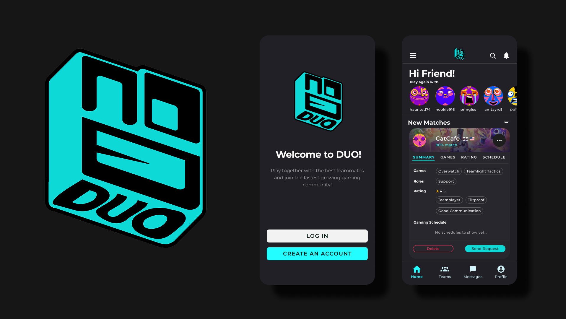
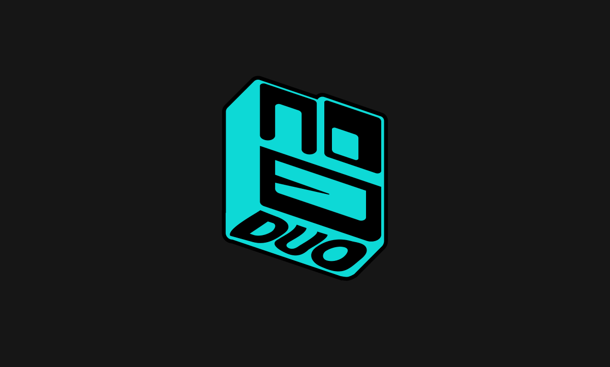
The duo.gg logo is clean and minimal with a subtle nod to connection and partnership — the core idea behind the platform. I explored several concepts around duality and balance before landing on a stylized wordmark that felt flexible across both web and mobile.
The duo.gg logo is clean and minimal with a subtle nod to connection and partnership — the core idea behind the platform. I explored several concepts around duality and balance before landing on a stylized wordmark that felt flexible across both web and mobile.
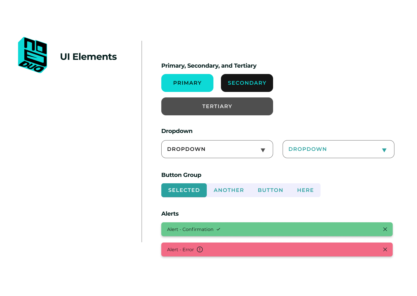
The logo is designed to represent the brand personality as a whole. The shapes being rounded squares and almost similar in thickness is meant to represent harmony and trust. It also reflects the playful, friendly, and social aspect of the brand by looking like a smiley face. A love for gaming is represented by the form having a similar likeness to that of a computer mouse. And lastly, the word “DUO” is playfully manipulated to create a form that represents the brand personality.
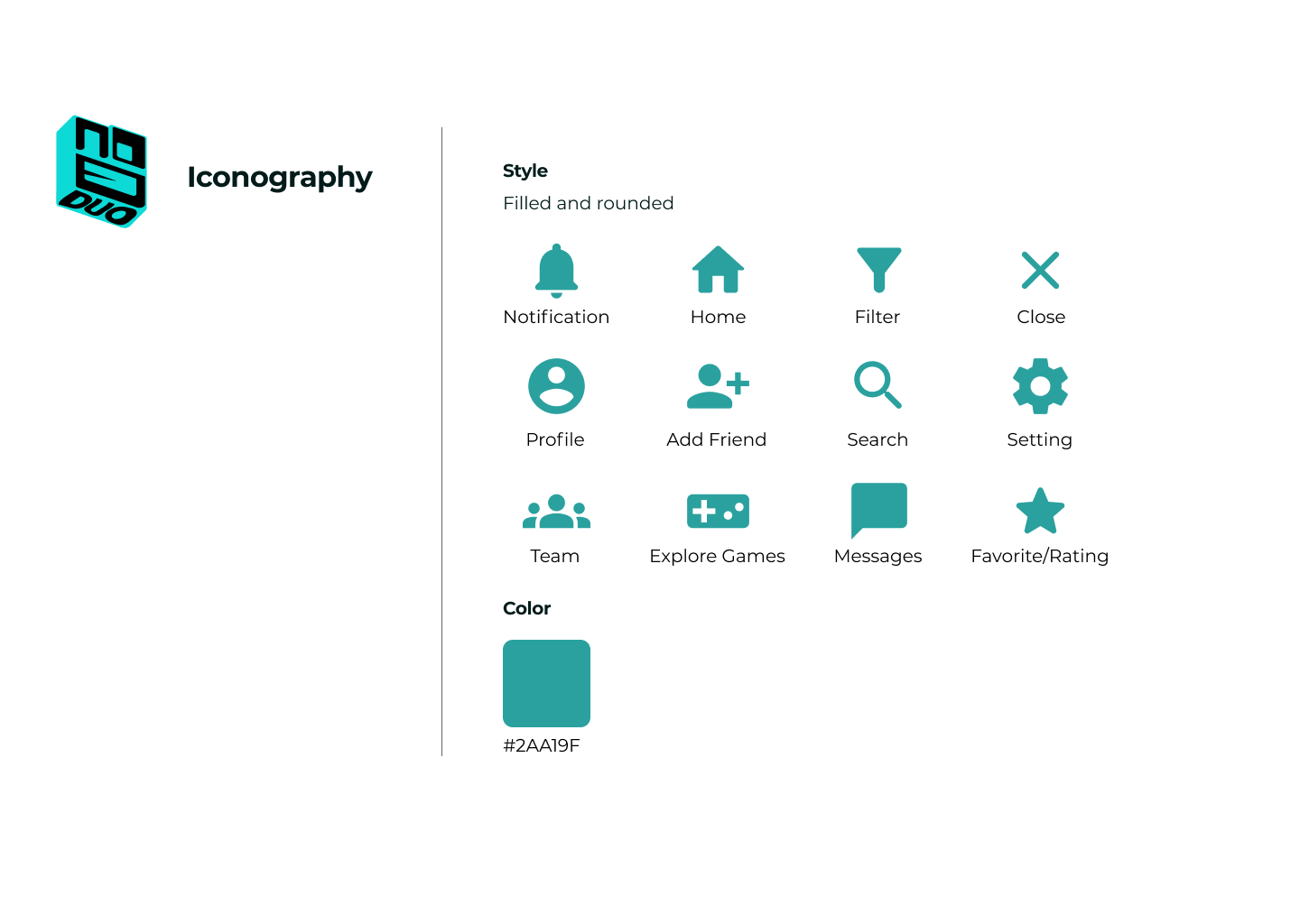
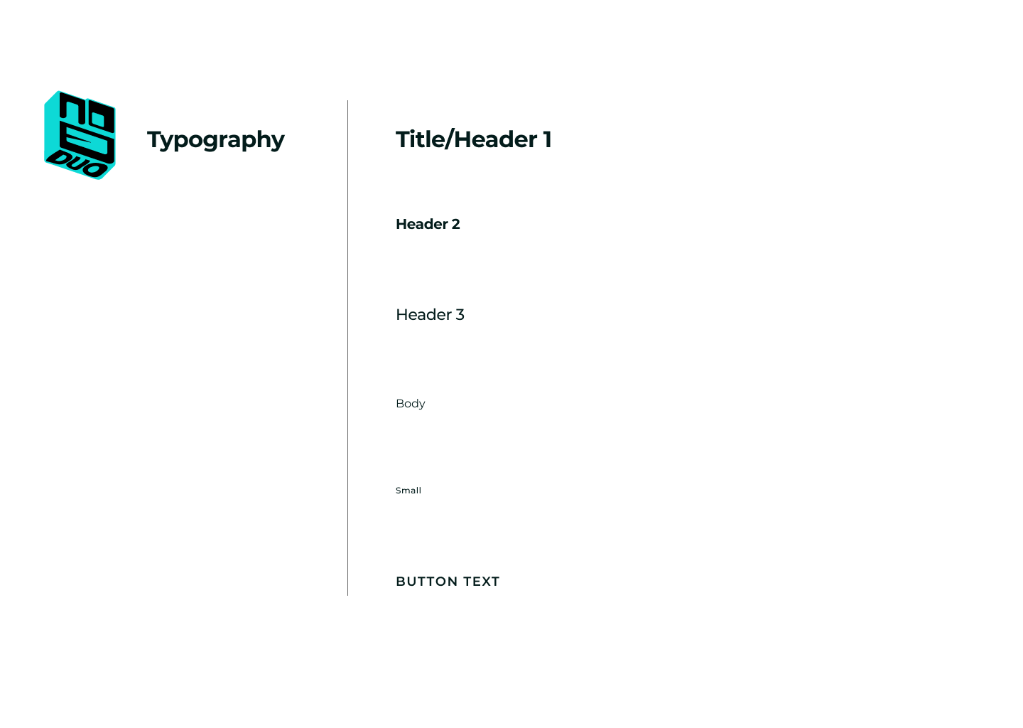
Typography
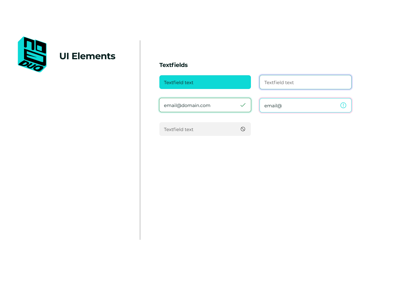
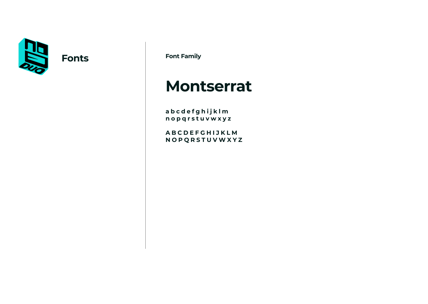
I chose a geometric sans-serif font to keep things crisp, readable, and slightly futuristic without being cold. The type pairing balances a tech-forward vibe with human warmth, helping the product feel social rather than strictly utility-based.
I chose a geometric sans-serif font to keep things crisp, readable, and slightly futuristic without being cold. The type pairing balances a tech-forward vibe with human warmth, helping the product feel social rather than strictly utility-based.